This sketchbook is where many design projects begin.
A principal in a design firm has three primary functions in the interior design process: Bring in work, maintain client contact and drive the creative concept. That is a full-time job and virtually everything else should be delegated. I’m adequate at bringing in work, my client contact is consistently strong and I particularly enjoy the creative component.
I investigate and express myself by sketching, and I have developed the skill of sketching-to-scale, which makes the conversion to working drawings easier. Some sketches are tangible and some are not. In either case, they inform the final package and ultimately the client’s built-out furnished space.
Here, with comments, are a variety of examples.
Drawing it out…for decades
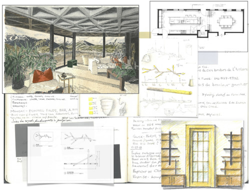
Above, formal renderings from 1982, during my time at the New York School of Interior Design–this was the training back in the day. Luckily for me, we were forced to learn to draw and we had to practice. Formal renderings of the era could take up to 50 hours. Today, I use a short-hand version of this, and if I need renderings of high-level detail for commercial work, I sub-contract it.
In 2020, little of this work is done by hand; it’s done with computer programs which I personally avoid. They are a valid and useful tool; I saw some recently in a meeting and they communicated the space they described well. But a computerized process can miss is the opportunity of discovering a solution through error.
The opportunity of error and the rewards of frustration
Through hand-drawing, many interior design process solutions happen with a slip of the hand, a smudge of your palm or a slash of frustration. This can’t happen in a computer program.
In 1994, I was trying to land a big account with a small trial project. I was determined to create a wonderfully impressive solution; something that would be outstandingly successful. After many hours of struggling with a difficult space, I got frustrated and slashed a mark across the page. When I sat back down after a beer and looked at it, there it was! The solution to the space plan. The slash divided the space in a way I never would have considered. I ran with it. The interior was built out from the resulting design, we secured the account and held it for more than 20 years. Those types of marks, spills and tears have inspired many objects and interiors.
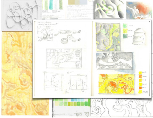
How do you conceptualize a custom-designed rug? Above, sketches, based on sketches, then apply color. Such ideas are rendered quickly with expression.
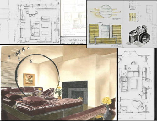
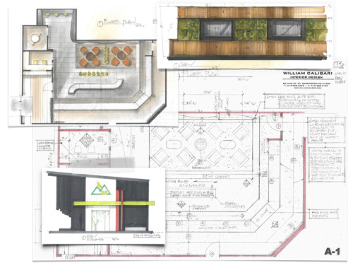
Berkshire Roots, a cannabis dispensary, is an interior that has sprouted several new accounts for us. Here are some of the presentation renderings and ideas that developed into the working drawings and, ultimately, finished interiors.
Life drawing, in my opinion, is the key to fresh quality renderings with a flair. Put down the straight edge, just lay it down as you imagine it when creating and as you see it when observing. Those are two different but connected things. By drawing the figure you can illustrate and render form. In the past, I attended an open studio every Monday night for three hours, for three years.

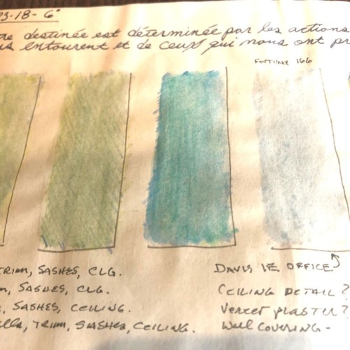
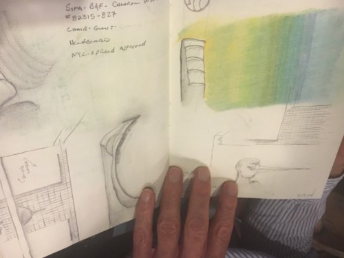
My sketchbook is perfect for color studies. I mostly use gouache and review the best hues with my client. You can see, in some of the studies, how easy it is to bracket a range of color and then hone in on tone and chroma. It’s so much more fun than just going to the color fan deck!
When it comes to the creative process, the original tools of pen and paper have served my design clients well.
Below, from the current sketchbook…

