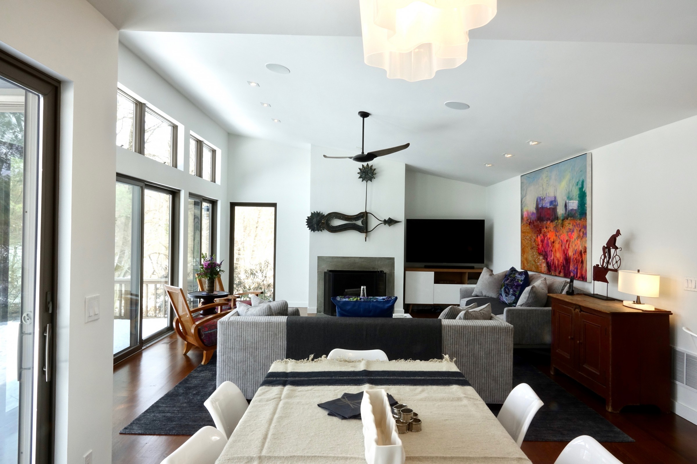
A few years ago, Amy and Scott Margolis were looking for a simpler version of their Berkshire weekend life: a smaller, more efficient country home with great interior design. On a river, please, for a bit of fishing.
View the Margolis house through our Matterport scan. Interior photos by Steve Petrie.
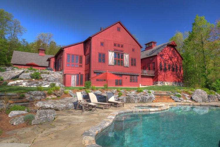
At the time, they were spending weekends at their rambling, rural farmhouse on 29 acres: they had invested with gusto in time and money to connect and renovate two adjacent barns that became a dramatic hilltop home of more than 6,000 square feet. The Berkshire project and its interior design were ambitious, with a pool and other great amenities for a family-friendly getaway. But by 2017, Amy and Scott decided, “enough is enough.” It was too big.
- The prior house, at 6,000 square feet, was too big. Photo ©2017 Chapin Fish, Brockman Real Estate
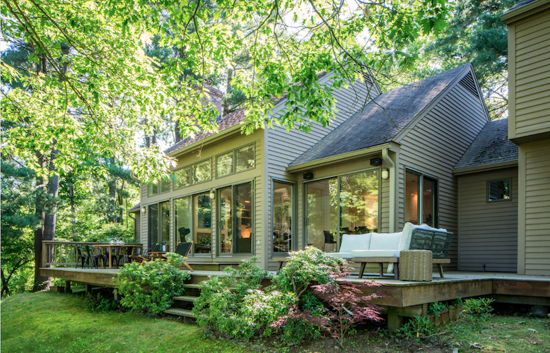
- The new house, at 2,500 square feet, was the perfect size.
Amy, who has a human resources consulting practice in New York City, and husband Scott, who works in financial services, sold the grand farmhouse. “It was great for the family, but then the kids grew up, and we wanted a simpler life,” they told us. What Amy and Scott found was a project – but a downscaled, manageable one: a 1980s, 2,500-square-foot home on five-acres along the bubbling Konkapot River. Once the home of a renowned fly fisherman who operated a fishing shop on the home’s main level, the house is just a few steps from the river bank.
The house had had scant attention for the last 30 years, but it had good bones, a perfect location and the promise of easier weekend life. Amy and Scott set out to find a top interior designer in the Berkshires, and we are so glad they found us.
“I had overdone it in the past, and so I was on a budget this time around,” Amy told us. “We wanted a contemporary feel this time, with warm touches. And I love the color red.”
We matched the Margolis style with their clearly defined budget and some creative design. Major line items: partially gutting the house, replacing floors and installing new, larger windows to bring the outside in. The new custom kitchen and bathrooms didn’t impact the budget as much as you would think. We worked very hard on detailing and materials to get what we wanted for what we had to spend, in the more scaled down space.
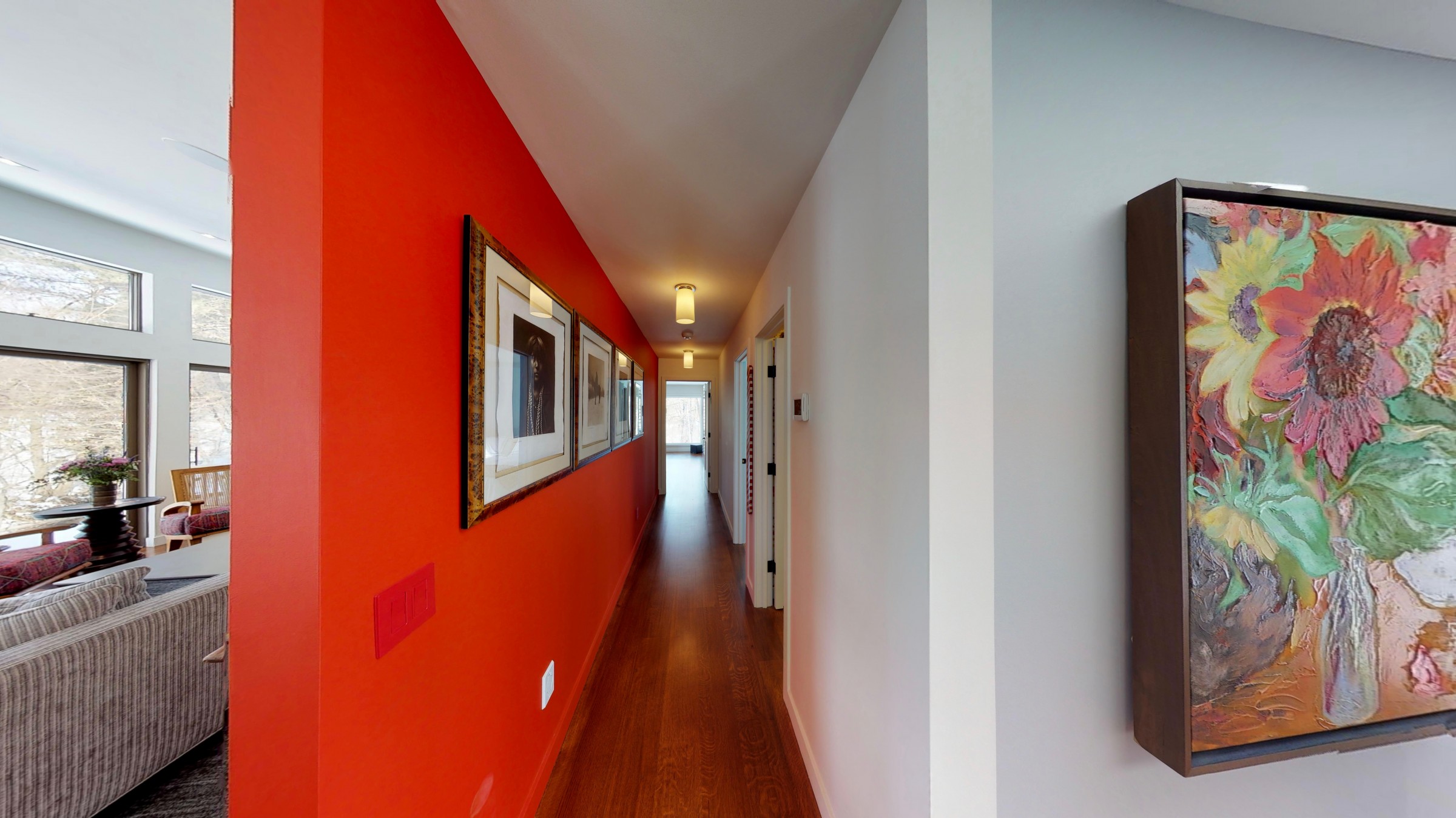
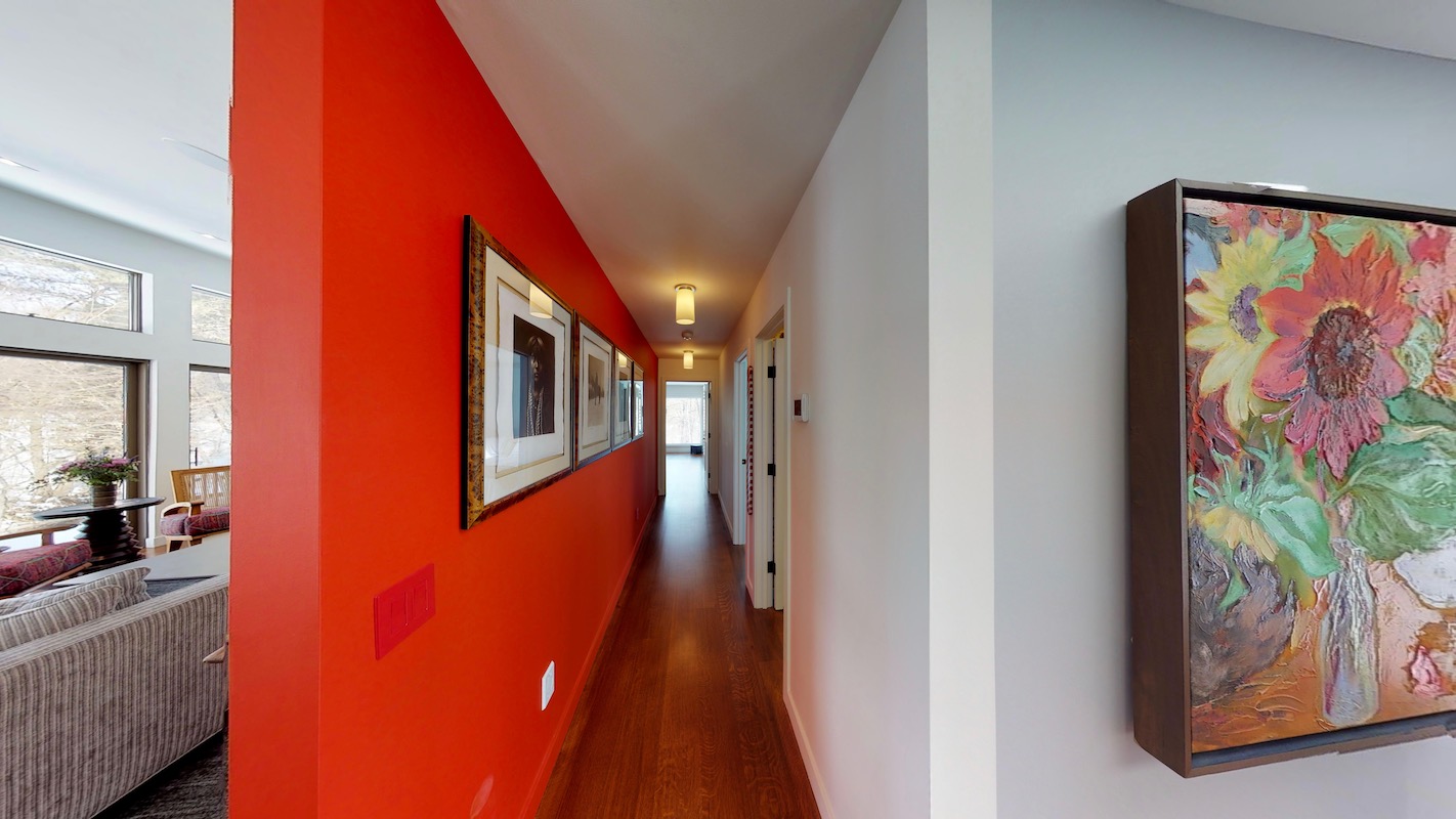
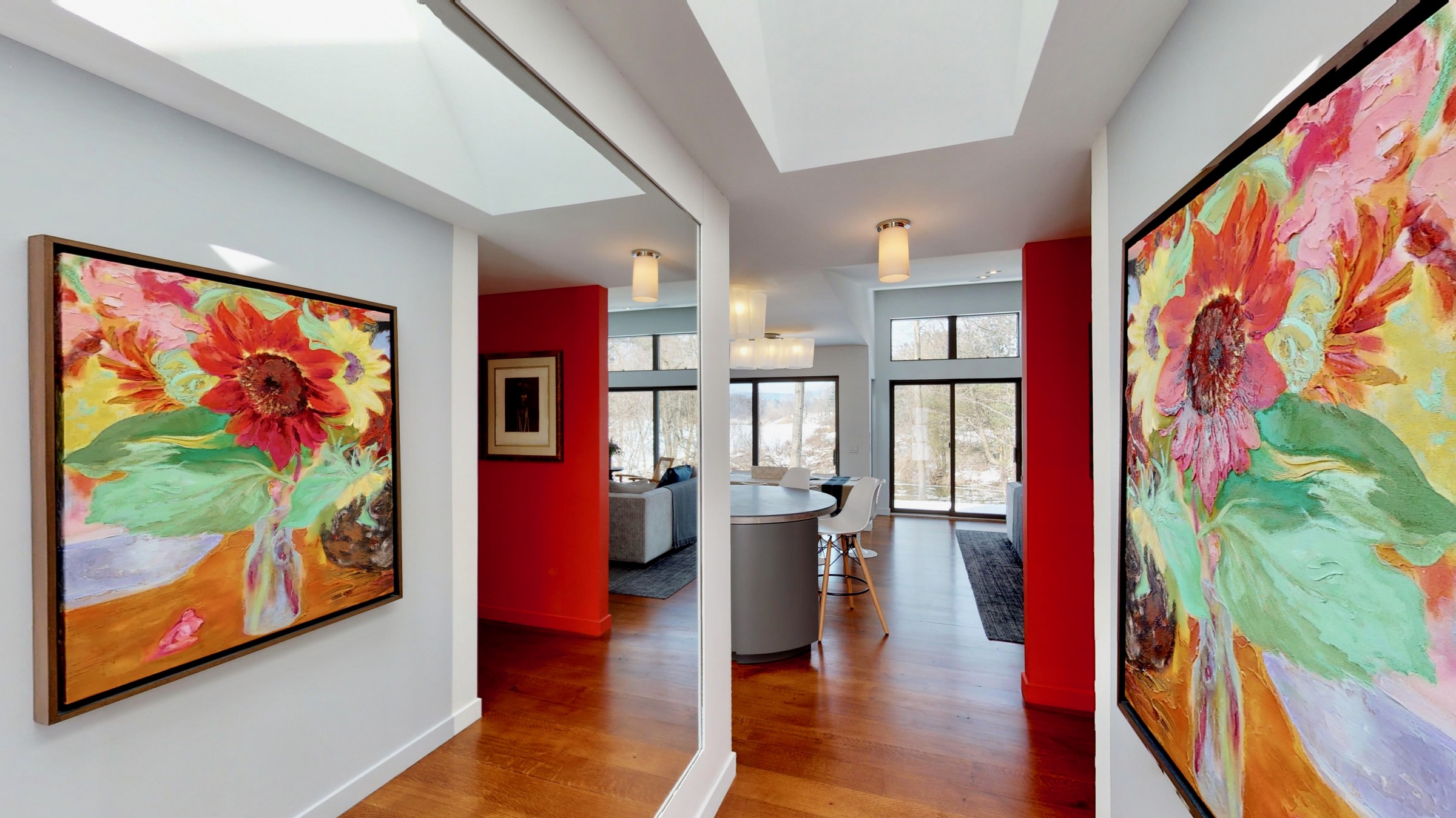
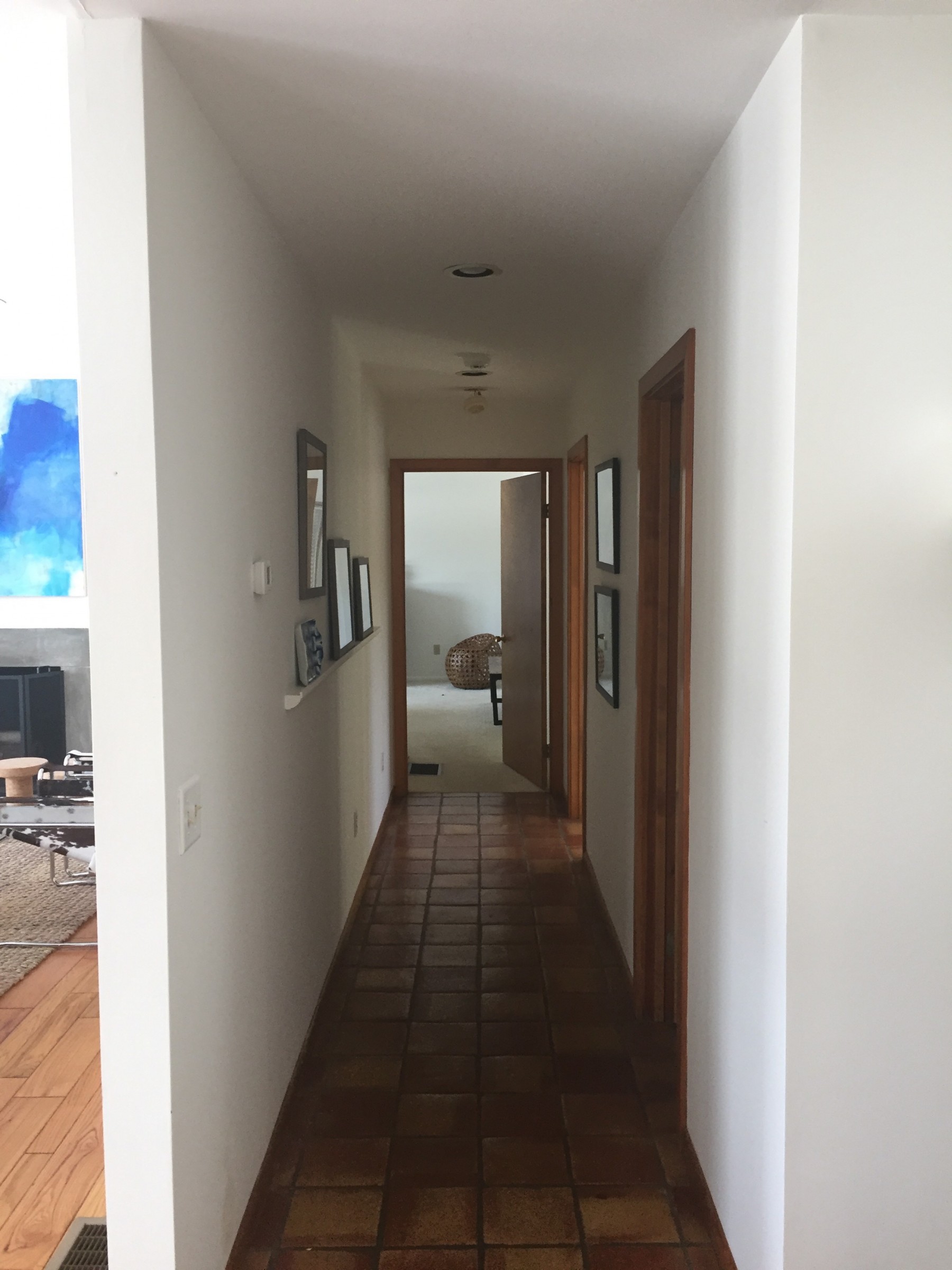
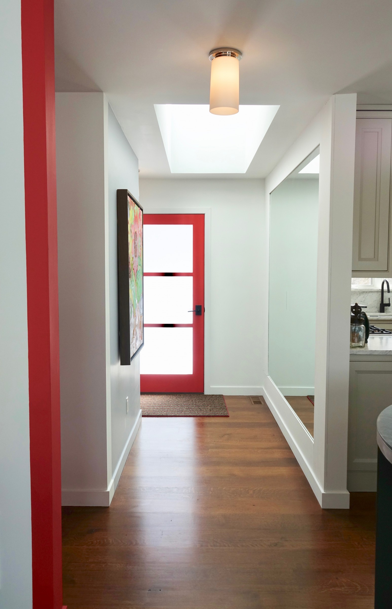
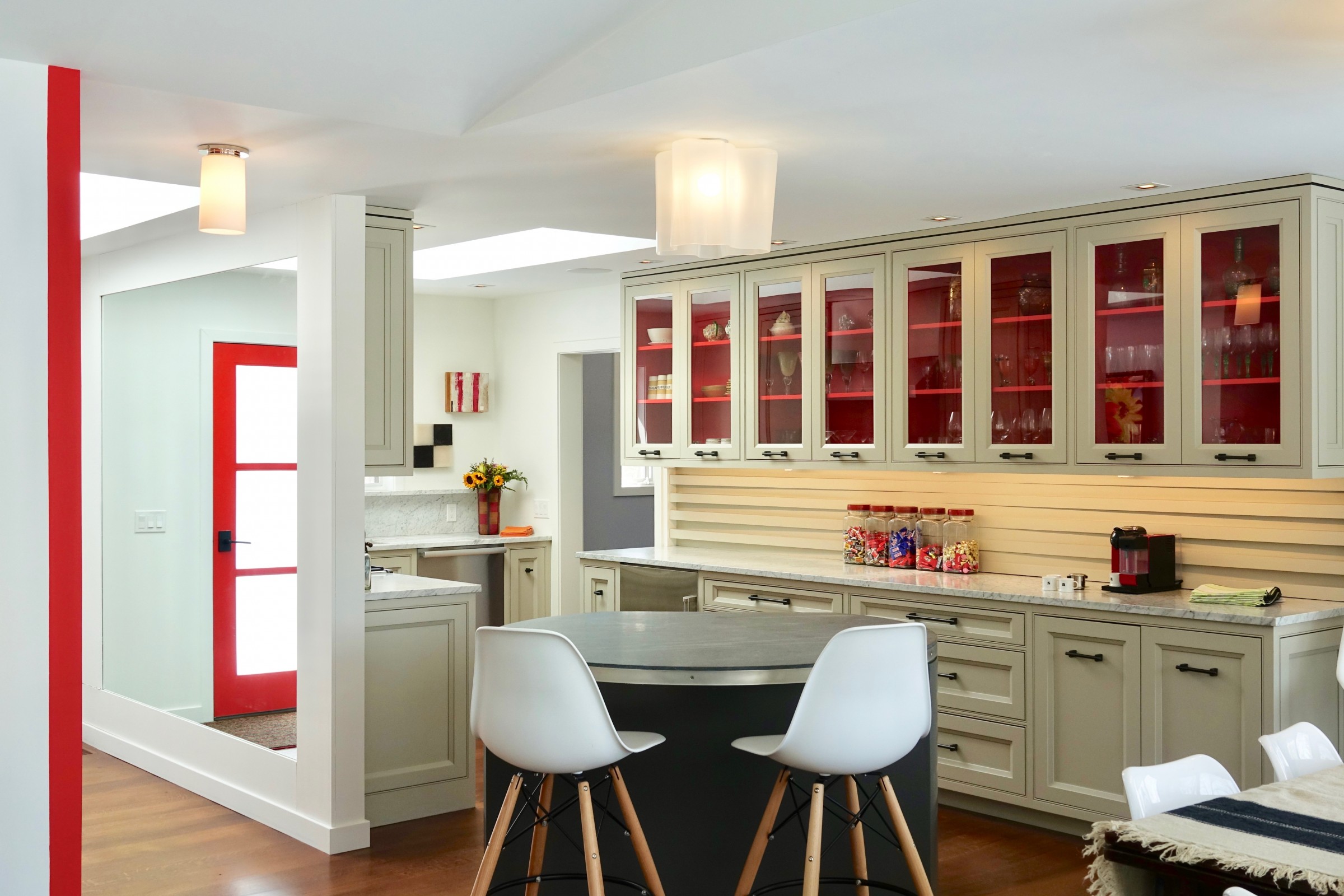
We came up with efficient solutions for a variety of “before” challenges. For instance, the original entry foyer was dim, small and dull. Scott and Amy considered tearing out a wall, but we suggested (successfully!) using color and a dramatic mirror to resolve the problem. The mirror captures natural light and creates interesting planes and volume; wood floors bring warmth. This is a perfect example of where a mirror isn’t perceived, but the additional space and texture are.
- Using Amy’s favorite color, we made the foyer a focal point of the house.
The contrast between the above pictures and the early entryway, below, is dramatic. The foyer was dim, boring and narrow. While still narrow, it’s far from boring and dim!
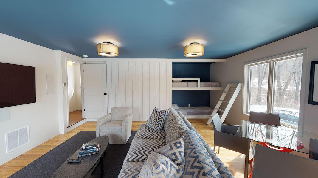
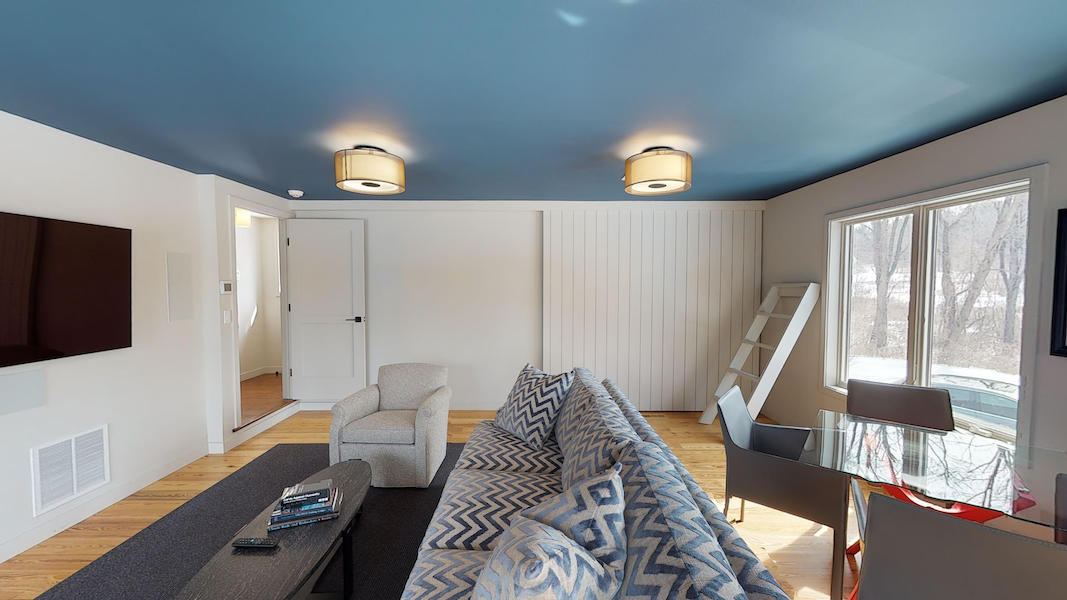
To steal some extra sleeping space, we closed off the entrance to the former “fishing lodge store” on the main floor (now a TV room) and installed a cozy sleeping nook with a bunk bed. The nook vanishes behind a sliding barn door — a great feature!
- In the TV room (former fishing shop), now you see it…
- Now you don’t. Secret sleeping!
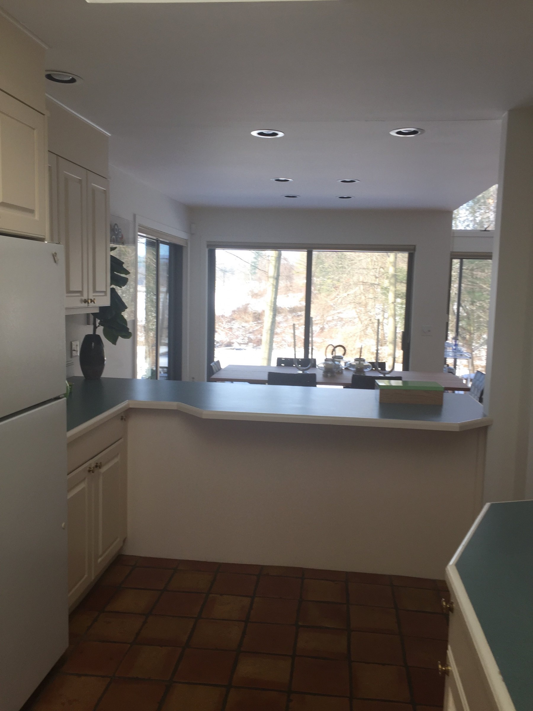
Before and after: below, the old kitchen with the extended countertop.
- The old kitchen counter extension was a barrier to traffic.
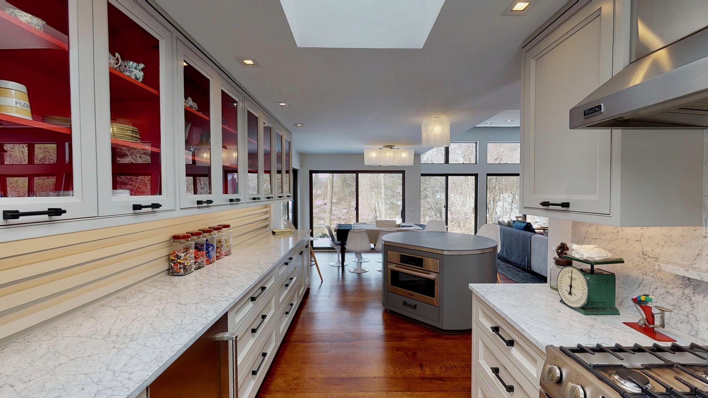
We removed the countertop opening the flow. So as not to lose counter space, we moved the fridge to an adjacent pantry. The island includes a freestanding stove on one side and seating on the other.

The new kitchen, with countertop removed. This view, slightly stretched, is captured in our Matterport scan,
And another kitchen view, which captures the foyer transformation as well.
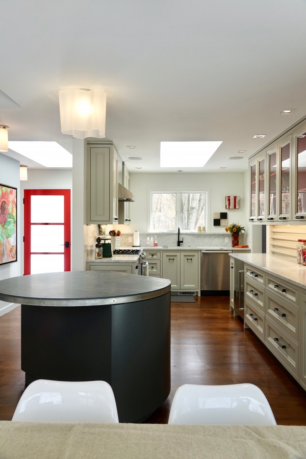
Looking back in: we preserved counter space by moving around the corner to a pantry.
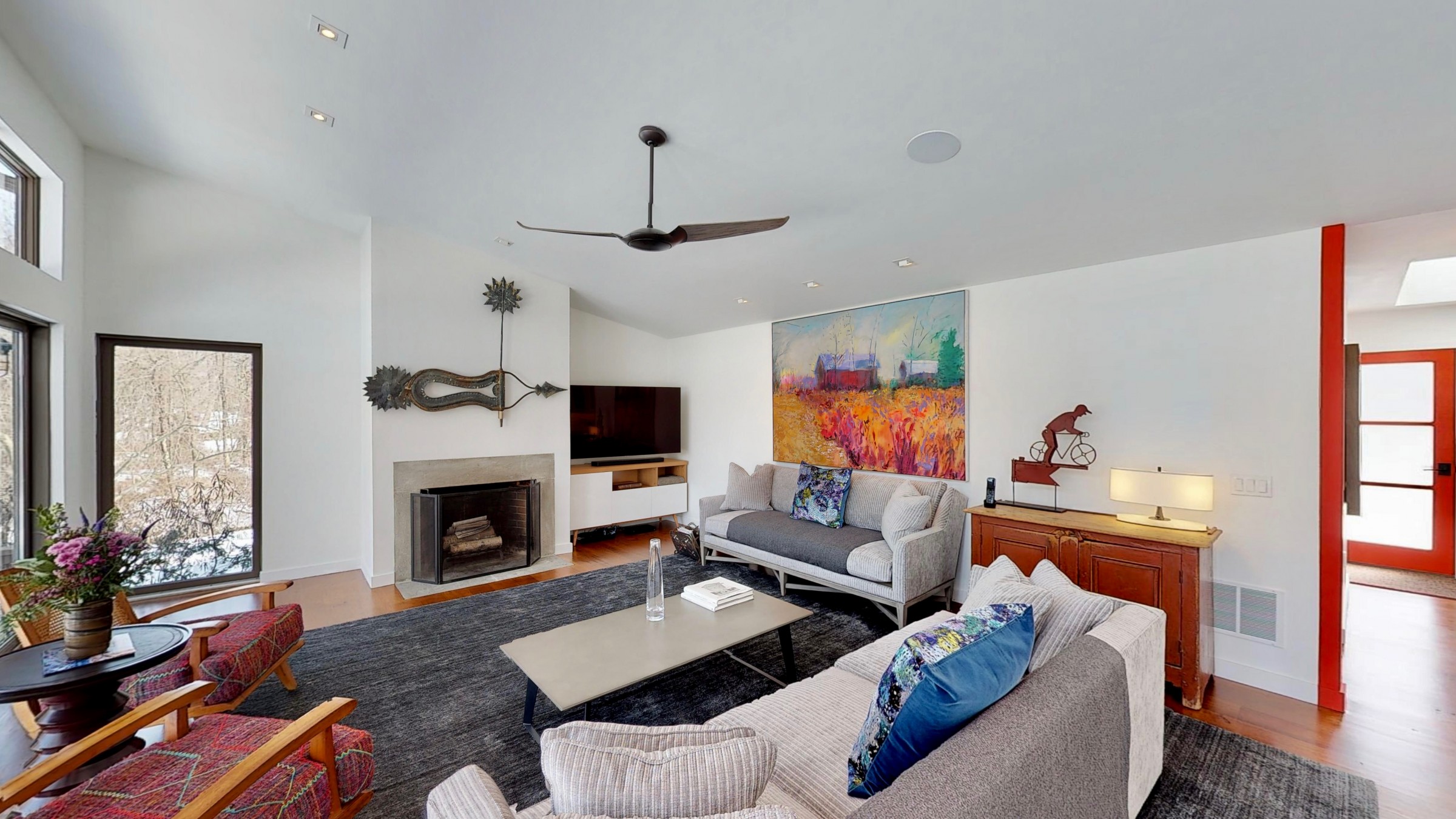
- Our client’s living room, with art we love, and a wealth of light. Elements of black draw attention to a dramatic painting.
We asked Amy and Scott for an assessment of our work, and here’s what they said: “William was amazingly creative and we really stuck to a budget, and he was great about it. He also has a great office team and we loved working with everyone.”
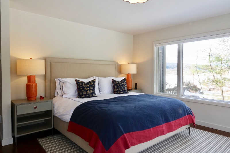
It’s true: every great interior designer loves an expansive budget, but we also like digging into a design requiring financial finesse, creative sourcing and scouting. For instance, we were able to source some reproduction tulip chairs for the Margolis dining table, for under $200 per chair.
- The special tulip chairs…
We asked what they most loved about their newly designed home.
“The whole house – it’s so manageable, I am so happy with 2,500 square feet!” says Amy, who has gone from seven bathrooms in the big farmhouse to 2.5 on the river. They’ve gone from a Viking Range to a “just a nice range,” no complaints.
- Another view of the living room.
We couldn’t be happier with the Margolis home. Our clients’ next phase is a screened porch and an expansion of the deck overlooking the Konkapot River. After all, summer is coming–and fishing.
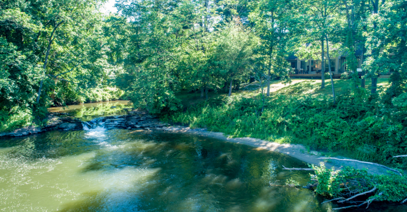
The Konkapot river, just steps from the home. Photo: William Pitt/Sotheby’s
